The 10 Most Harmful Mobile SEO Mistakes (and How to Fix Them)

Did you know that a website that is not optimized for mobile devices can make it virtually invisible in today’s world? Since search engines are promoting mobile-friendly experiences and users are increasingly relying on their smartphones for everything from online shopping to news updates, it’s important to have a strong mobile SEO strategy. But, navigating the ever-evolving landscape of mobile SEO can be challenging. That’s why we’re here to help!

In this guide, we’ll go over the top 10 most damaging mobile SEO mistakes businesses make and provide you with actionable solutions to fix them. So let’s get started!

#1. Core Web Vitals: Slow Site Speed

Page Loading Speed

Imagine waiting for a webpage to load, like watching paint dry on your phone. Frustrating. Slow loading times are a death knell for mobile SEO. Core web vitals, a set of metrics that measure user experience (UX), include Largest Contentful Paint (LCP), First Input Delay (FID), and Cumulative Layout Shift (CLS). These directly impact mobile SEO rankings.

Solution:

  • Run a website speed test using Google’s PageSpeed Insights or other tools. 
  • Identify bottlenecks like large images, unoptimized code, and render-blocked resources. 
  • Use image compression techniques to improve loading speed, take advantage of browser caching, and minify code.

#2. Core Web Vitals: Intrusive Interstitials

Pop-ups may seem like a great way to grab attention, but intrusive interstitials – ads or prompts that cover a significant portion of the mobile screen – can severely harm mobile SEO. Google penalizes websites that use excessive or poorly timed interstitials, hindering their search visibility.

Solution

  • Focus on user-friendly alternatives. 
  • Consider well-placed banner ads or opt-in prompts that don’t obstruct the content. 
  • Ensure any pop-ups are easily dismissible and appear only after users have had a chance to engage with the content.

#3. Missing Content: Blocked Resources

Search engines rely on website content to understand and rank your pages. If essential resources like CSS, JavaScript, or images are blocked from crawling, search engines can’t properly index your content. It can lead to missed ranking opportunities and a confusing user experience.

Solution: Double-check your robots.txt file to ensure essential resources aren’t blocked from crawling. Verify that your server is configured correctly and allows search engine bots to access all necessary files.

#4. Missing Content: Unplayable Content

Mobile users expect a seamless experience. Flash-based content, outdated video formats, or audio files that require specific plugins won’t work on most smartphones and tablets. It not only frustrates users but also sends negative signals to search engines.

Solution: Leverage HTML5 video formats and responsive design principles to ensure your content displays and functions flawlessly across all devices. Utilize responsive players that automatically adjust to screen size and offer alternative formats like downloadable MP3s for audio content.

#5. Missing Content: Bad Redirects and Broken Links

Broken links and faulty redirects create a frustrating user journey and hinder search engine crawling. When a user clicks a link and ends up on an error page (404 Not Found), it creates a negative impression. Similarly, redirects that loop endlessly or lead to the wrong page confuse both users and search engines.

Solution:

  • Regularly audit your website for broken links and redirects. 
  • Use webmaster tools like Google Search Console to identify and fix these issues promptly. 
  • Implement 301 redirects (permanent) for pages that have moved permanently, and avoid using temporary redirects (302) unless necessary.

#6. Mobile-Only 404 Errors

expired landing page

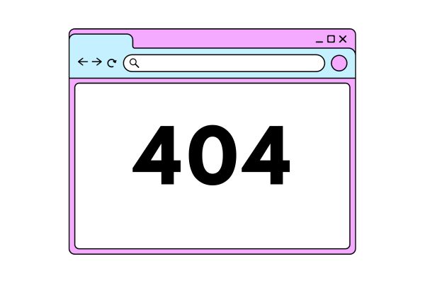
While a generic 404 error page might suffice for desktop users, it’s a missed opportunity on mobile. A mobile-specific 404 page can provide a more user-friendly experience by offering search functionality, a sitemap, or links to the homepage and popular content.

Solution: Create a custom 404 error page specifically designed for mobile users. Make it visually appealing and easy to navigate, and offer helpful options to keep users engaged on your site.

#7. No Rich Snippets

Rich snippets are those informative summaries that appear below website listings in search results. They can include product ratings, event details, or author information. While not a direct ranking factor, rich snippets can significantly improve click-through rates (CTRs) on mobile searches.

Solution: Implement schema markup on your website. This code provides search engines with additional information about your content, allowing them to generate rich snippets in search results. Tools like Google’s Structured Data Markup Helper can simplify this process.

#8. Bad User Experience (UX): Not Specifying Mobile Viewport

Mobile screens come in various sizes and resolutions. If your website doesn’t specify a mobile viewport, it won’t adjust to different devices. It leads to users having to pinch and zoom, which can be a major usability nightmare.

Solution: Include a viewport meta tag in your website’s code. It tells the browser how to scale and size your content to fit the user’s device screen. It ensures a consistent and comfortable viewing experience across all mobile devices.

#9. Bad User Experience (UX): Poor Mobile Design

A website that looks fantastic on a desktop can be a disaster on a mobile screen. Tiny fonts, cluttered layouts, and elements that require precise clicks are all mobile UX killers. Users won’t tolerate a frustrating experience – they’ll bounce off your site.

Solution: Embrace responsive design principles. It ensures your website automatically adjusts its layout and elements to fit the user’s device. Use large, easy-to-read fonts, optimize images for mobile viewing, and ensure all buttons and clickable elements are sized appropriately for touchscreens.

#10. Lack of Mobile Keyword Optimization

Keywords are still king in SEO, but how people search on mobile differs from desktop searches. Mobile users often use shorter, more conversational phrases. Optimizing your content for the right mobile keywords is crucial for attracting the right audience.

Solution: 

  • Conduct thorough mobile keyword research. 
  • Use tools like Google Keyword Planner and analyze how users search for your products or services on mobile devices. 
  • Integrate these relevant mobile keywords naturally into your content and page titles to improve mobile search rankings.

Related: Mastering Mobile SEO: Your Guide to Mobile-First Indexing Optimization

Final Words

By avoiding these common mobile SEO mistakes and implementing these solutions, you can ensure your website offers a seamless and user-friendly experience for mobile visitors. Also, It can help to improve your search engine ranking, engagement, conversions, and, ultimately, business success in the mobile-driven world.

Leave a Comment

Your email address will not be published. Required fields are marked *

Scroll to Top